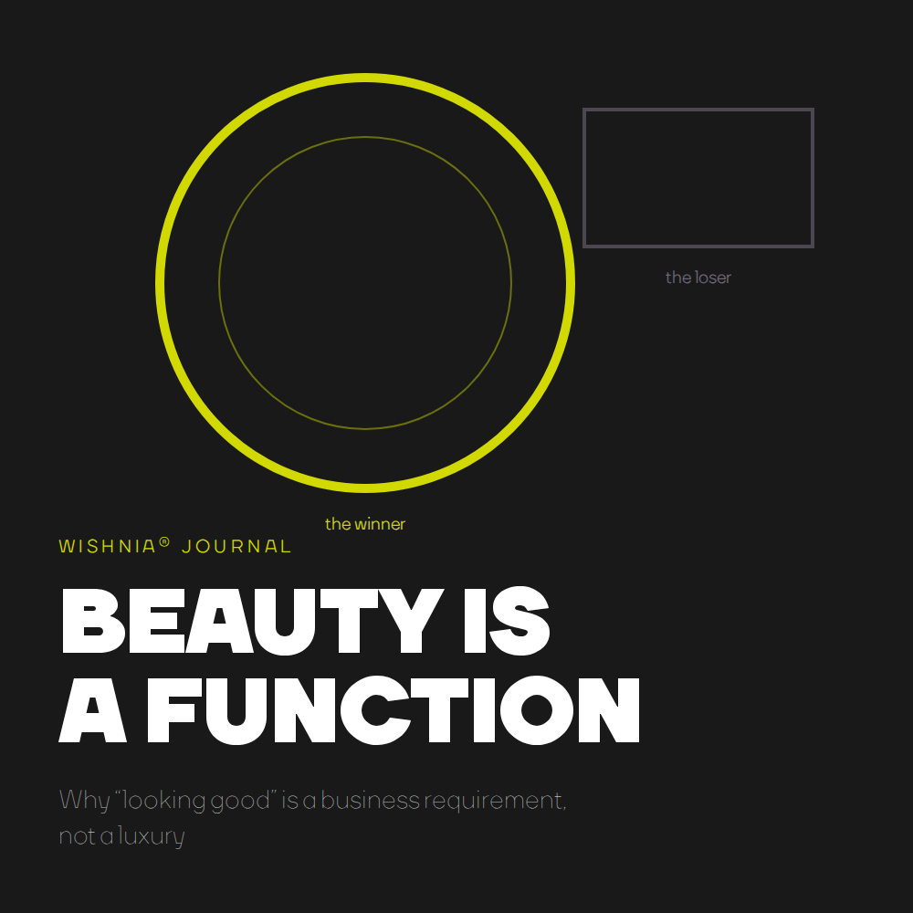
Дизайнеры извиняются за красоту. Им не стоит этого делать. Доказательства показывают, что красота меняет то, как люди чувствуют, ведут себя и делают выбор, а это делает её одним из самых практичных инструментов, которыми располагает бренд.
beauty is in the eye of the beholde
Есть фраза, которая нанесла дизайну больше вреда, чем любое сокращение бюджета: красота — в глазах смотрящего. Она звучит скромно и демократично, и дает всем право рассматривать эстетику как вопрос личного вкуса — субъективный, второстепенный, за который невозможно отстоять свою точку зрения на деловой встрече.
Stefan Sagmeister has spent years dismantling that sentence. In his talks and in his work on beauty, he points out that the phrase comes from a nineteenth-century romance novel, was never confirmed by any scientific survey — and that if it were actually true, it would make our work meaningless. Why invest in making something beautiful if everyone's judgment is random noise?It isn't random. And that fact has direct consequences for how brands should be built.
The agreement we pretend doesn't exist
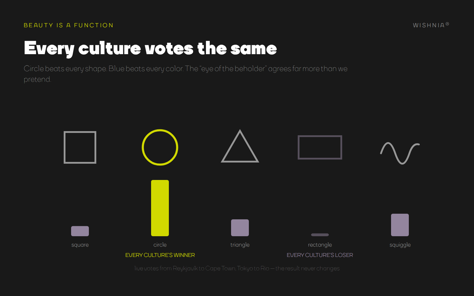
Sagmeister opens his talks with a live experiment he has run from Reykjavík to Cape Town, from Tokyo to Rio de Janeiro. He shows the audience five shapes and asks them to vote. Every culture, every time, chooses the circle as the most beautiful and the rectangle as the ugliest. Then he shows six colors. Every culture, every time, blue wins and brown loses. The ugliest thing in the world, he jokes, is the thing the audience just voted for piece by piece: a brown rectangle.
This is not a party trick. The psychologist Chris McManus built a test around Piet Mondrian: a real composition next to a subtly faked one, lines shifted from where the artist finally settled them. Audiences overwhelmingly identify the original — including in countries where almost no one has seen the painting before. X-rays of Mondrian's canvases show him moving lines again and again until the composition felt right. Strangers on other continents, decades later, feel it too.
The most striking evidence comes from the aesthetics lab of Dr. Helmut Leder, who works with Alzheimer's patients. People who no longer recognize their own children can still arrange six paintings from most to least beautiful — and when the test is repeated two weeks later, with no memory of the first visit, they produce the same order. When nearly everything else is gone, the sense of beauty remains. It appears to be one of the oldest, deepest layers of being human — which is exactly what the archaeology suggests: hand axes made hundreds of thousands of years ago are consistently symmetrical, though a asymmetrical sharp stone kills a saber-toothed tiger just as well. We were making things beautiful before we were fully ourselves.
For a brand, this changes the question entirely. If judgments of beauty were private and chaotic, aesthetics would be a lottery. Because they are largely shared, aesthetics is a discipline — something you can get right or wrong.
Beauty changes behavior, not just opinions
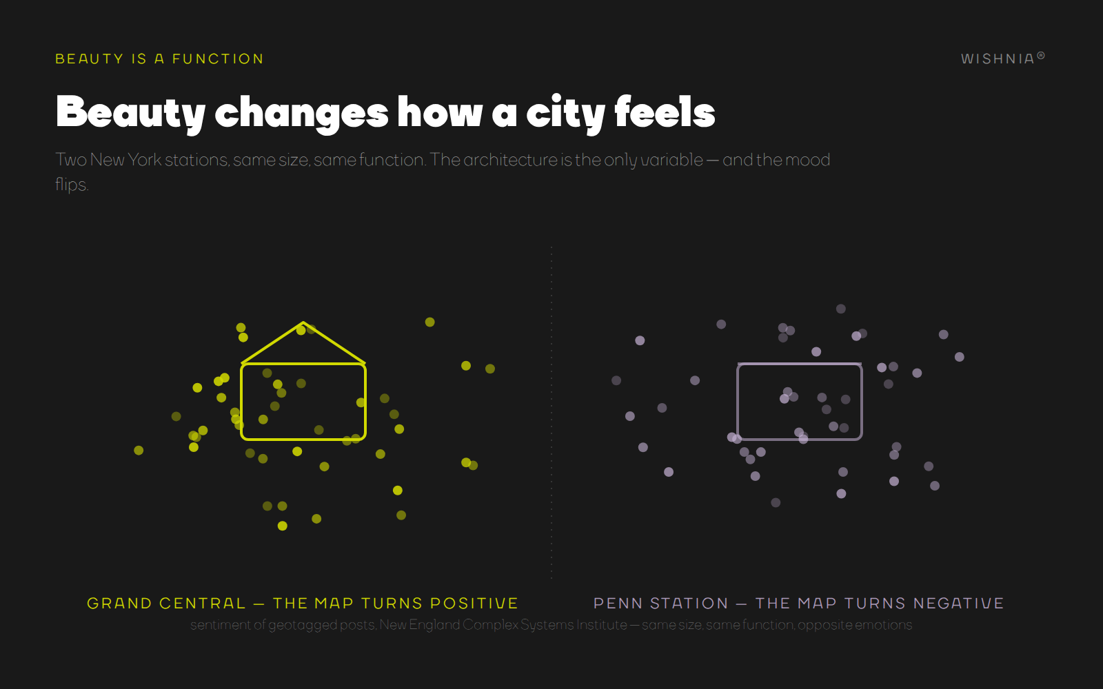
The strongest part of Sagmeister's argument is not that people agree on what is beautiful. It is what beauty does.New York has two train stations of comparable size and function. One is Grand Central Terminal; the other is Penn Station. Researchers at the New England Complex Systems Institute mapped the emotional tone of geotagged posts across the city: around Grand Central, the map glows positive; around Penn Station, it turns negative. Same city, same function, same commuters — opposite emotional outcomes. The architecture is the variable.
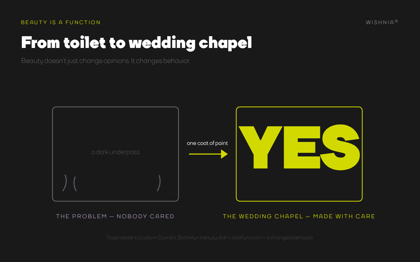
Sagmeister's own studio produced a miniature version of the same effect. In Dumbo, Brooklyn, a client asked them to do something about an underpass that had become a place people urinated in at night. Instead of a "please don't" sign, the studio painted one enormous, intricate YES across the walls. The underpass became a backdrop for wedding photographs. One coat of paint transformed, in his words, a toilet into a wedding chapel — not by adding function, but by adding beauty. Behavior followed.
This is the mechanism brands live and die by. A customer's decision to trust a company, to stay on a website, to pick a package off the shelf, to photograph a space and share it — these are behavioral outcomes, and beauty demonstrably moves them. When Sagmeister says that companies "A/B test everything except aesthetics, completely misunderstanding the provable fact that beauty is a function," he is describing most of the digital economy. Teams optimize button placement to the pixel and treat the emotional register of the whole experience as an afterthought.
What the twentieth century got wrong
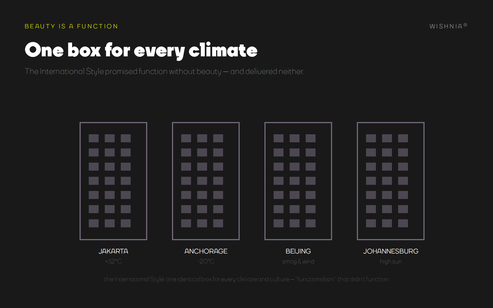
If beauty is this powerful, why did it become embarrassing to argue for? Sagmeister traces the story to his fellow Austrian, the architect Adolf Loos, whose 1908 essay Ornament and Crime declared decorative ornament a moral failing of the age. Loos influenced the Bauhaus, which produced genuine masterpieces — and then, Sagmeister argues, the next generation misread those ideas as economic functionalism. The result was the International Style: identical boxes erected in Beijing and Johannesburg, Anchorage and Jakarta, as if one form could be equally right for tropical heat and arctic cold. Buildings stripped of everything "unnecessary" turned out to be unnecessary themselves — unloved, dysfunctional, and in many cases dynamited within decades. Functionalism, pursued without beauty, failed even at functioning.
The lesson for brand design is uncomfortably current. Our industry has its own international style: the same geometric sans-serif, the same flat illustration, the same safe minimalism applied to a fintech startup and a bakery alike. It is efficient to produce and easy to defend in a meeting — nobody gets fired for choosing the brown rectangle of branding. But it fails at the one job identity exists to do: making a company impossible to mistake for anyone else. Sameness is not neutrality. Sameness is a cost.
Beauty is not the opposite of simplicity
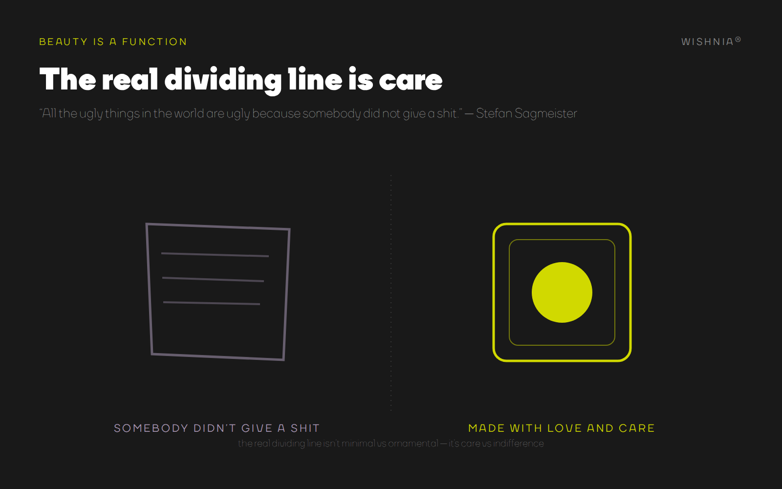
The debate usually collapses into a false choice: minimalism versus ornament, restraint versus expression. Sagmeister ends his talk by refusing the frame altogether. The fight, he says, is not between simplicity and complexity. The real dividing line is whether something was made with love and care — because "all the ugly things in the world are ugly because somebody did not give a shit."
That definition travels well beyond architecture. An interface can be minimal and deeply cared-for, or minimal and indifferent. A logo can be ornate and precise, or ornate and lazy. Users cannot articulate kerning or grid systems, but they register care instantly and unconsciously — and they read it, correctly, as a signal of how the company will treat them. Beauty, in this sense, is the most honest advertising there is: it cannot be claimed, only demonstrated.
There is even a poetic proof that care outlasts ideology. The Viennese glassware maker Lobmeyr discovered a letter from Adolf Loos himself, allowing that at some later date small ornaments might be added to the drinking set he designed in 1930. The studio Lobmeyr called to design those ornaments — the ornaments on the glasses of the author of Ornament and Crime — was Sagmeister's.
What this means in practice
For our own work at WISHNIA, we treat beauty the way we treat strategy: as a functional requirement with measurable consequences, not a garnish added at the end. That means aesthetics enters the project at the positioning stage, not after it — because the emotional register of a brand is part of what it promises. It means testing not only whether an interface works, but how it makes people feel while it works. It means designing identities that age the way Roman streets age rather than the way freshly-painted white boxes do — systems with enough depth and material honesty to gain character over time instead of losing it. And it means training the eye deliberately: collecting, photographing, and studying things that were made with care, because judgment is a muscle and the feed does not exercise it.
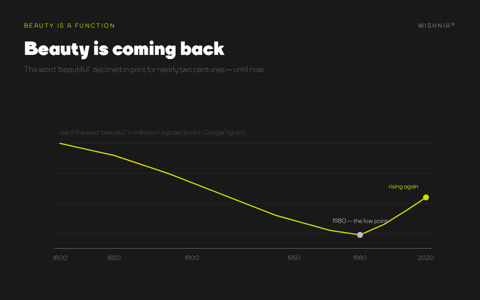
Sagmeister points to one more encouraging data point. Across the millions of books Google has digitized, the frequency of the word beautiful declined steadily from around 1800 to its lowest point near 1980 — and has been rising since. The culture is remembering something design spent a century apologizing for.
Beauty is not decoration on top of the work. Beauty is the work, doing its job. The brands that understand this will be felt before they are read, remembered after they are seen, and chosen for reasons their competitors cannot copy — because care, like beauty, cannot be faked.
This article draws on Stefan Sagmeister's talk on beauty. His book "Beauty" (with Jessica Walsh) goes much deeper.