

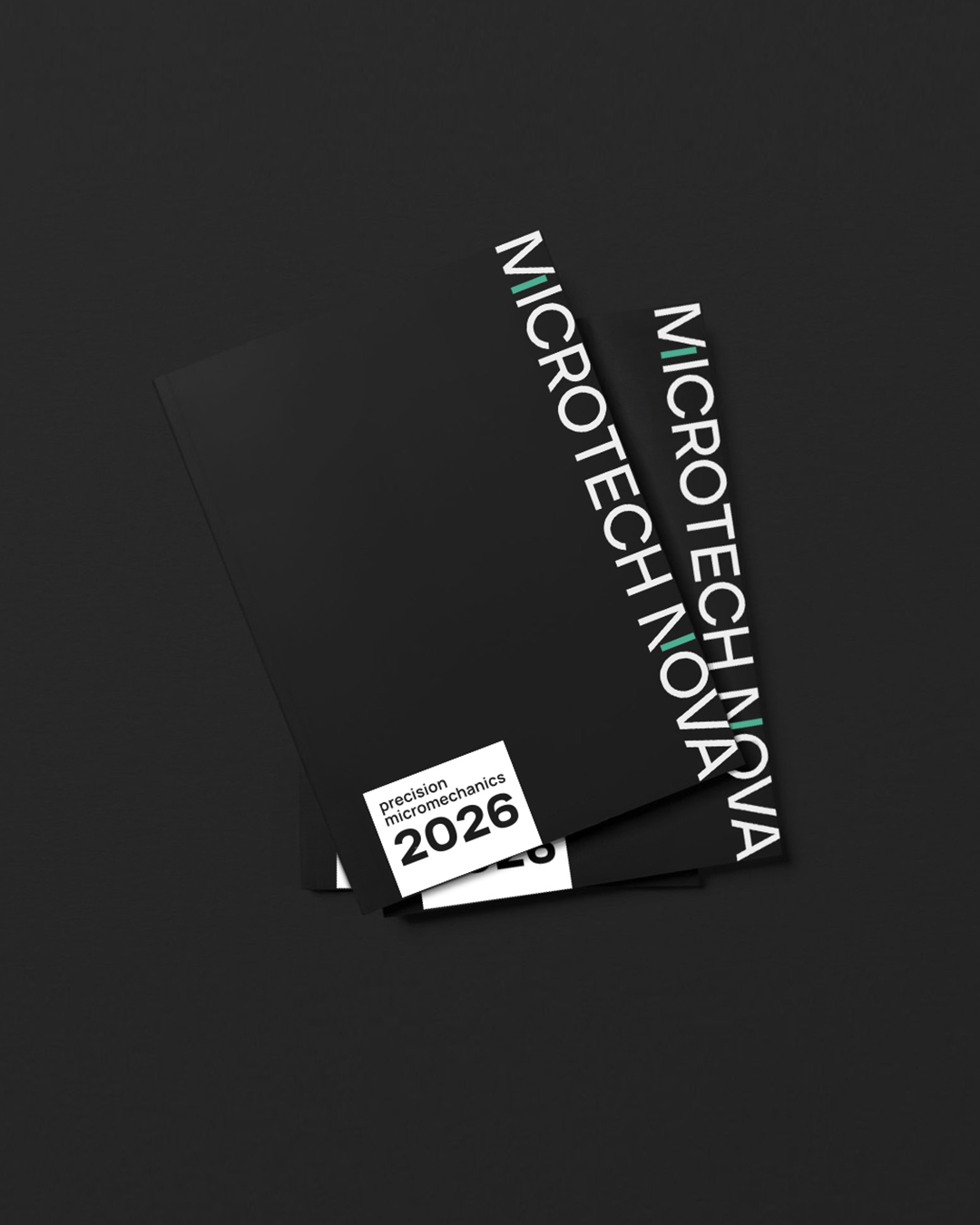
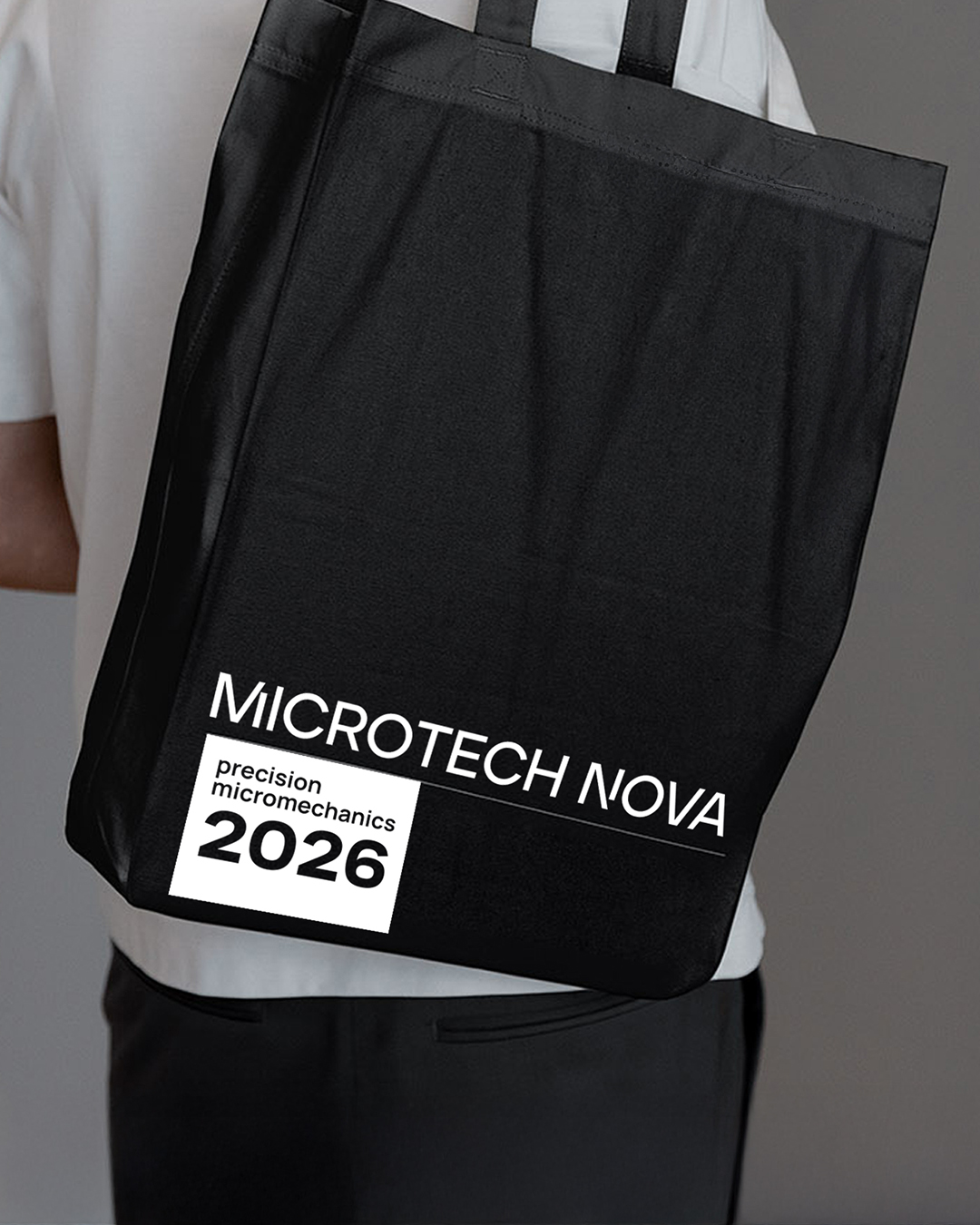
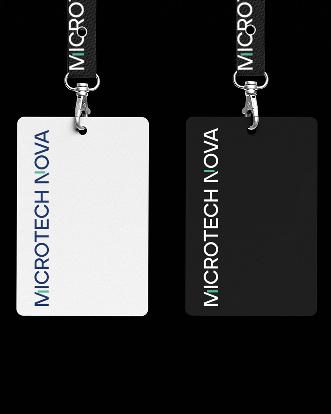
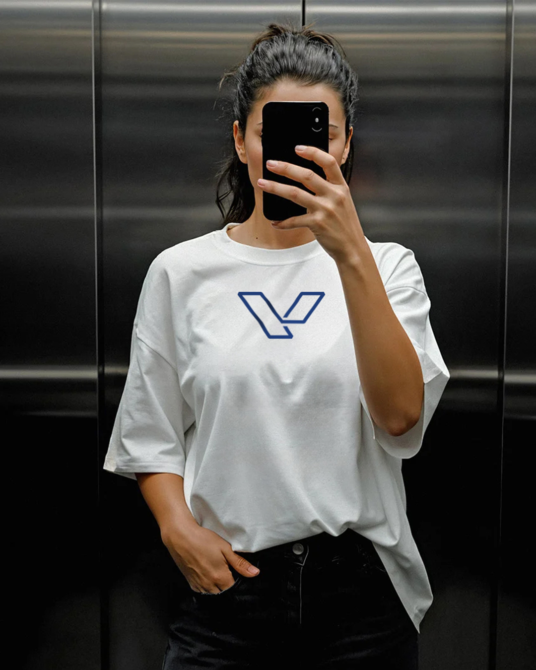
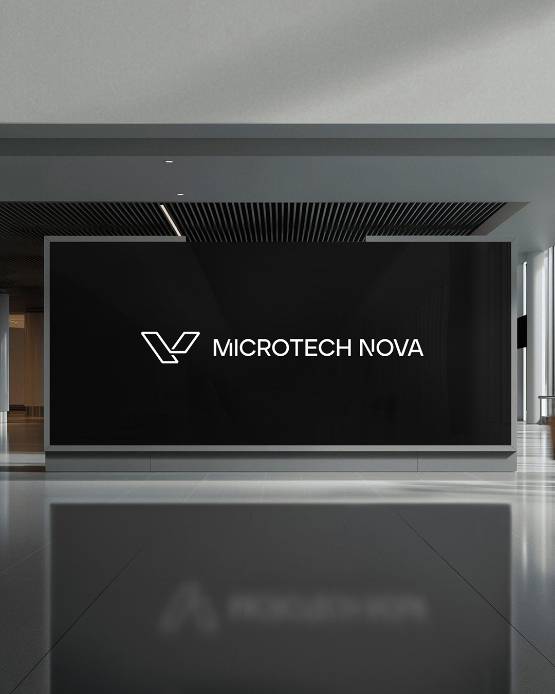
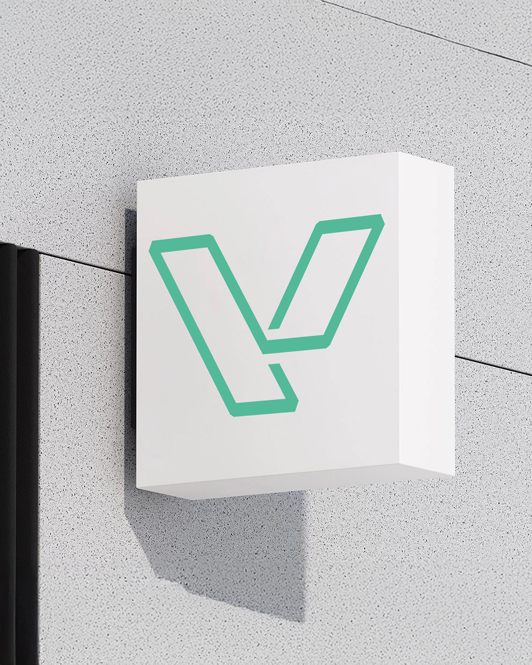
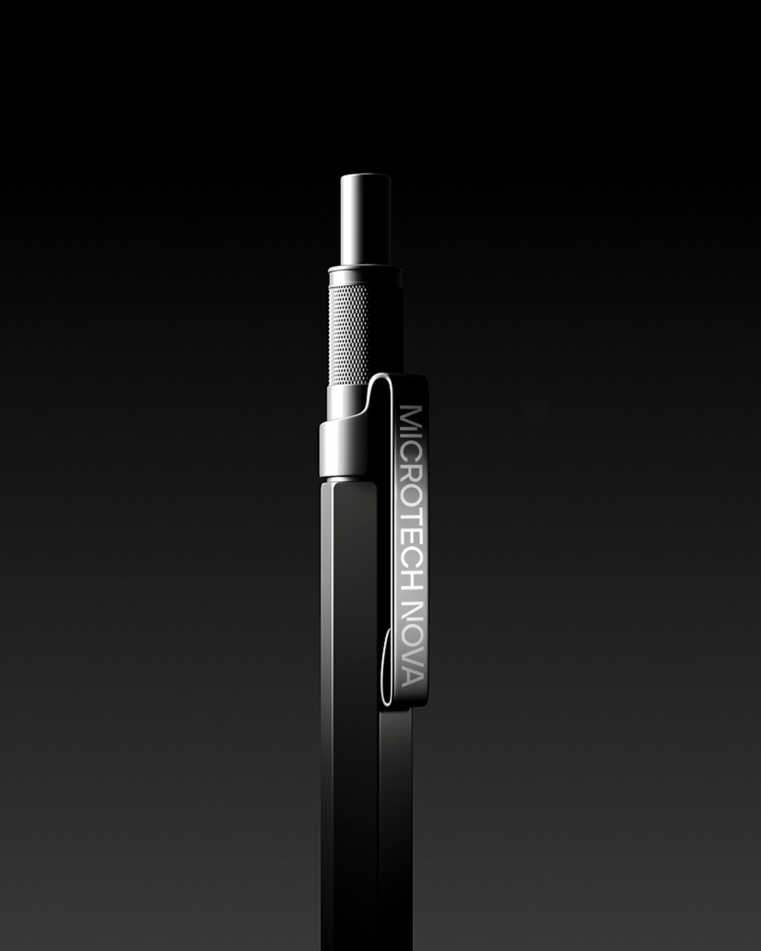

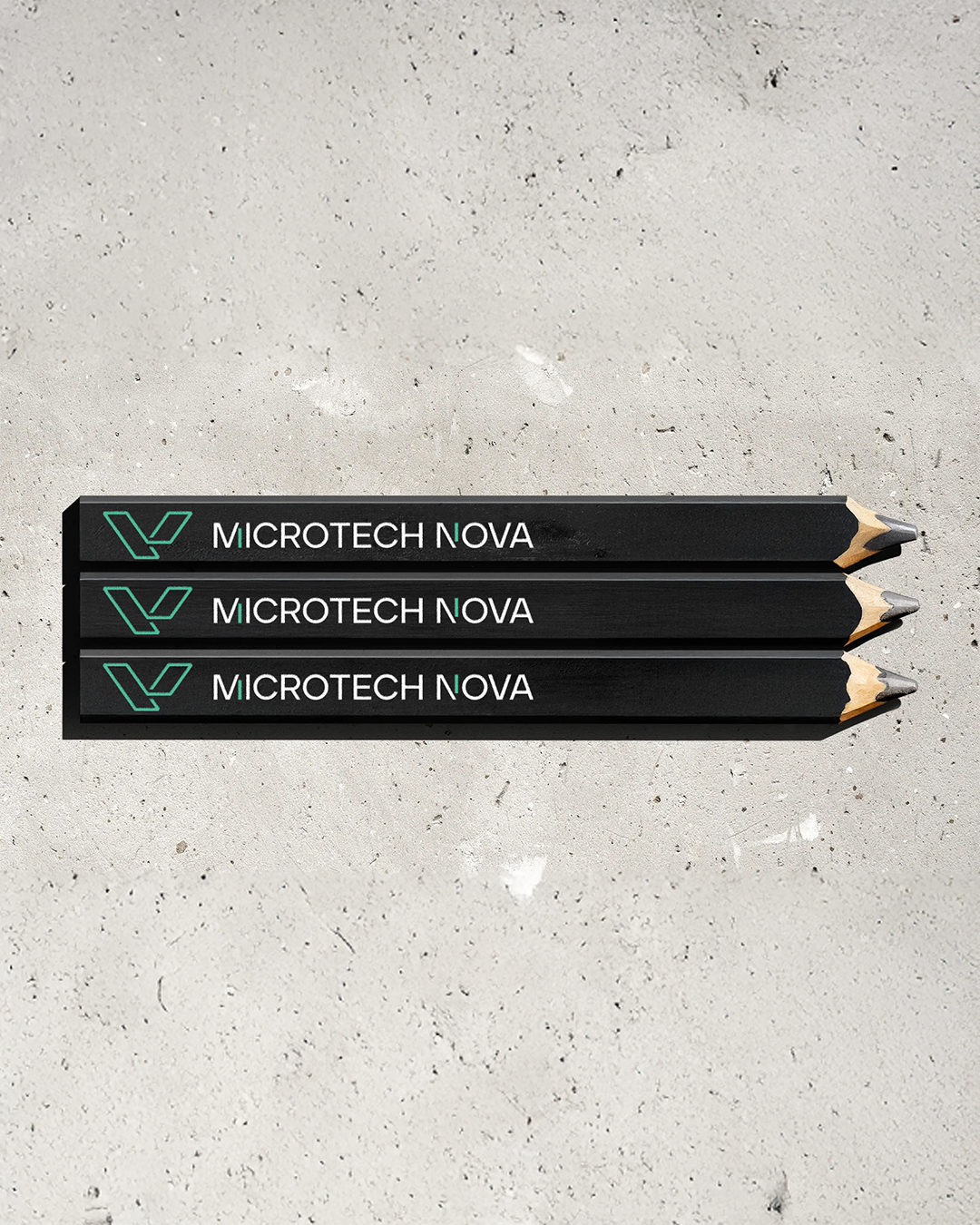

Our projects showcase our abilities, and we use our blog to discuss them in detail.
Translating the world of precision micromechanics into the language of design is a massive challenge, but the team delivered flawlessly. In our industry, errors of fractions of a millimeter are unacceptable, and their work displayed the exact same geometric accuracy and attention to detail that we demand from ourselves. They captured the complexity of micromechanics and translated it into a clean, elegant, and modern visual language. No templates—every element was crafted with genuine passion, conceptual depth, and care. Our new brand identity commands respect and distinctly sets us apart on an international level. If you are looking for a branding partner with visionary insight and uncompromising standards, this is the right choice. Highly recommended!
George Zubchev
CEO


